
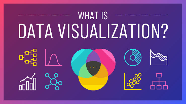
Data visualization is the practice of converting raw data into graphical or visual formats. It helps in understanding trends, patterns, and outliers within complex data sets. By transforming data into visual representations such as charts, graphs, and maps, data visualization allows for more intuitive and quicker comprehension. Let’s explore the key aspects of data visualization, its importance, and some of the most effective visualization techniques with illustrative examples.
The Importance of Data Visualization
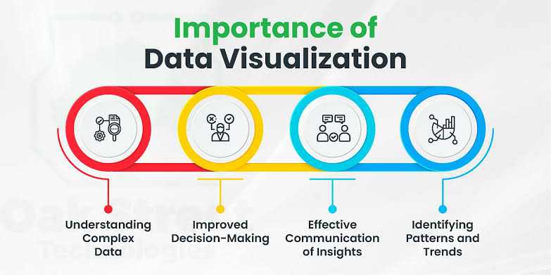
1.Enhances Comprehension
Human brains are wired to process visual information more effectively than text. Data visualization leverages this by transforming data into easily digestible visual formats, enabling quicker understanding and better retention of information.
2. Identifies Trends and Patterns
Visualizations can highlight trends and patterns that might be missed in raw data. This is crucial for data-driven decision-making as it provides a clear picture of the current scenario and potential future outcomes.
3.Facilitates Communication
Data visualization is an effective tool for communicating complex data to a broad audience. Whether it’s a business presentation or a scientific report, visualizations can convey key messages more compellingly and persuasively.
4. Supports Decision Making
In the business world, data visualization aids in making informed decisions by presenting data in a clear and actionable manner. It helps stakeholders understand insights and make decisions based on data-driven evidence.
Types of Data Visualizations
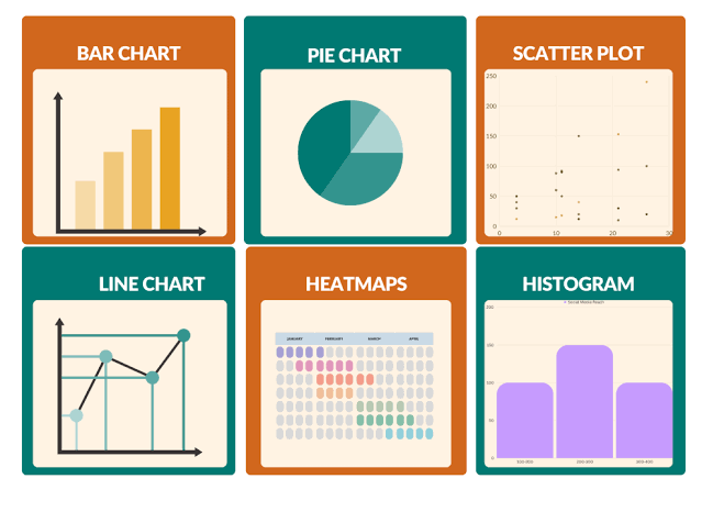
1. Bar Charts
Bar charts are ideal for comparing quantities across different categories. Each bar represents a category, and its length corresponds to its value.
2. Line Charts
Line charts are perfect for showing trends over time. Data points are connected by lines, making it easy to see upward or downward trends.
3. Pie Charts
Pie charts represent parts of a whole. Each slice of the pie shows a category’s proportion relative to the total.
4. Scatter Plots
Scatter plots display values for typically two variables for a set of data. They show how much one variable is affected by another and are used for observing relationships between variables.
5. Heat Maps
Heat maps use color to represent data density or value. They are excellent for showing variations across a spatial area or within a matrix.
6. Histograms
Histograms are similar to bar charts but are used to show distributions of a single variable over a range. They show the frequency of data points within specified ranges.
Best Practices for Data Visualization
Know Your Audience
Tailor your visualizations to the audience’s level of understanding. Avoid overly complex visuals if the audience is not familiar with the data.
Choose the Right Chart Type
Select the chart type that best represents the data and highlights the key insights. Using the wrong chart type can mislead the audience or obscure important information.
Keep It Simple
Avoid clutter. Focus on the essential information and use minimalistic designs to make the data stand out.
Use Colors Wisely
Colors should enhance the data, not distract from it. Use a consistent color scheme and be mindful of color-blind users by using colorblind-friendly palettes.
Provide Context
Include titles, labels, and legends to provide context to the visualizations. This ensures the audience understands what the data represents without additional explanations.
Conclusion
Data visualization is an essential skill in the modern data-driven world. It transforms raw data into meaningful insights, facilitating better understanding, communication, and decision-making. By choosing the right visualization types and following best practices, you can unlock the true potential of your data and make informed decisions that drive success