The most overlooked screens in your product are the ones with nothing on them.
If you’ve ever opened an app and seen a message like “No data found” or worse — a totally blank screen, then you’ve encountered an empty state.
Chances are, if you’re building digital products, you’ve spent hours perfecting layouts, tweaking iconography, and debating whether the primary CTA should be blue or green. But here’s the question: What happens when there’s nothing to show?
That’s where empty states come in. And too often, we don’t treat them like real parts of the product. But they are. In fact, they might be the most honest part of your UX (user experience).
Empty States Are Cold Starts
The most overlooked screens in your product are the ones with nothing on them.
If you’ve ever opened an app and seen a message like “No data found” or worse — a totally blank screen, then you’ve encountered an empty state.
Chances are, if you’re building digital products, you’ve spent hours perfecting layouts, tweaking iconography, and debating whether the primary CTA should be blue or green. But here’s the question: What happens when there’s nothing to show?
That’s where empty states come in. And too often, we don’t treat them like real parts of the product. But they are. In fact, they might be the most honest part of your UX (user experience).
Empty states appear when a screen has no content, either temporarily or by default. They show up when:
A new user signs up and hasn’t added anything yet
A search yields no results
A list was cleared
A connection error prevents data from loading
Most of us treat these as edge cases, but they’re not. They’re core. These are the moments that define first impressions, reduce confusion, and guide action.
Empty States Are the First Impression
Here’s the thing: your product’s first impression isn’t made when everything’s working perfectly. It’s made when nothing’s there.
The first time a user opens your app, they’re probably staring at a list with zero items, a blank dashboard, or an empty feed. That’s not a glitch. That’s an opportunity.
Done right, an empty state:
Bring about expectations
Serve as guide to the next step
Projects brand’s personality
Brings about trust of the brand
When empty states are done wrong it confuses, frustrates, and sometimes ends the user journey before it begins which is not what we want.
We have Different Types of Empty States
They are as follow:
Onboarding States
This is usually experienced when users sign up for the first time or first-time use. They should orient the user, explain what’s going on, and suggest what to do next, without overwhelming.
Blank Data States
No activities yet? No projects created yet? No playlists created? All these screens should gently push the user to take necessary actions to add, import, or create something.
No Search Results
The easiest ways to lose a user. Instead of “No results found,” try suggestions, alternate queries, or prompts to refine their search.
Error States
When things do not work, users get frustrated. A thoughtful empty state here can acknowledge the problem and give a next step,retry, refresh, or report.
Empty States Are a Team Sport
Good empty states don’t happen by accident. They require:
Designers who understand emotion and flow
Writers who bring tone, clarity, and empathy
PMs who prioritize these moments in the roadmap
Developers who handle the logic and delivery
Researchers who validate how people actually feel in these moments
When you build with empty states in mind, you build a product that feels thoughtful, human, and complete.
Real Product Design Happens in the Gaps
Ask a great designer what they think of empty states, and you’ll know how seriously they take user experience.
Because designing empty states is not only about making something visually appealing. It’s about answering questions the user hasn’t even considered yet:
What am I doing here?
Is there a problem with the network or did I press the wrong button?
What is the way forward?
Your job isn’t to just fill the screen, it’s to guide behavior, reduce anxiety, and make people feel welcome, even when there’s nothing there.
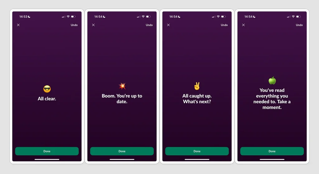
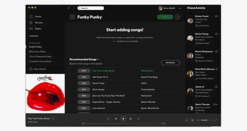
Spotify Knew The Importance Of Empty States And Got It Right.
Ever created a well-designed app or site just to hit roadblock when there is literally nothing to look at? It happens more often than not. Take Spotify. When they did a major redesign of the app, the new minimalist look attracted trouble, blank playlists and zero-out feeds made users look at blank screens.
So they redesigned it.
They did the smart thing. They tackled these empty states head-on. By adding playful illustrations, helpful guiding text, and clear calls-to-action (CTAs) like ‘Start adding Songs,’ ‘Create your first playlist,’ ‘Explore new artists,’ ‘Recommended Songs,’ and ‘Recommended Playlist,’ they transformed those blank screens.
The result? Higher engagement, better retention, smoother onboarding, and more users actually doing what the platform intended. This wasn’t magic. It was simply a design that was aware of empty states, understanding that even a blank canvas needs a purpose and an invitation.
Empty States Are Edge Cases? No. They Are Experiences.
Most users won’t say, “Wow, what a delightful empty state.” But they’ll know when it’s missing.
They’ll feel confused, uncertain, or stuck, and they won’t always tell you why they left.
So design for the following moments:
When there’s nothing to display/show
When something is broken
When users don’t have an idea of what to do
That’s where product design lives, in the awkward in-betweens, in the moments where care is felt but not seen.
Design the Nothing
Empty states aren’t voids, they’re invitations.
They say, “We thought of you.” They give you reassurance. They give guidance for your actions. They teach. They mirror your brand.